Early playtesting
I recently finished implementing the first real dungeon (following the tutorial zone), and I spent a few days playtesting it. I don't want to put too fine a point on playtesting at this stage, but I also wanted to make sure that my general approach was on track before I continued making content. Basically, I wasn't just testing combat balance, but skill configuration, dungeon design, game flow, stat formulas, and so on. I played through the first dungeon (three floors) twice - once with the current default party, and once with a party of the other five aspects (classes).
This ended up being really valuable. I made a ton of adjustments based on these sessions, but there were a few main takeaways:
- I had a lot of fun playing the core gameplay loop – clearing as much of the dungeon as I could before retreating to spend my Remnants (cash) on healing and maybe a new piece of equipment. There's plenty of polish left to add, but I'm pretty happy with how the game feels to play right now. This was actually a pleasant surprise and a relief. Combat alone took a lot of iteration and tuning, and I really wasn't sure how the rest of the game was shaping up.
- The difficulty was overall too low. Monsters were often too weak or too few in number, leveling was too fast, and equipment was too cheap. There were also a few bare spots where it felt like there should have been monsters or treasure. I touched up the layout a bit and bumped up the difficulty, particularly on the end boss.
- My second party ended up being noticeably easier than the first due to buff and debuff assignment being a bit more lopsided than I intended. I also found that some aspects blurred together too much and didn't feel distinct. I revised some of the skill assignments and altered some skills to hopefully make each aspect more interesting and defined, but this will be an ongoing focal point.
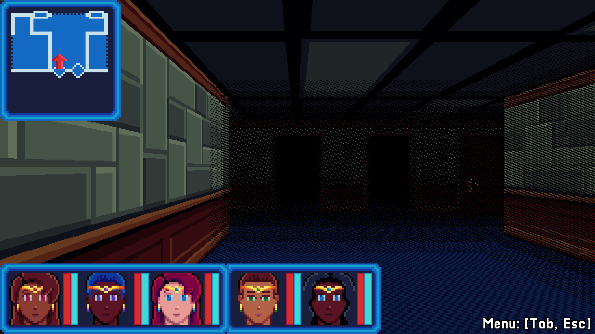
Besides that, I have mostly been checking off lots of smaller features and quality of life improvements – things I haven't gotten around to until now. One thing in particular that I have been consistently dissatisfied with was the environment visuals – the textures, the colors, and the dithered “torchlight” sight radius. I finally managed to tweak these things to where I'm reasonably happy with them, at least for this dungeon. Here's the entrance to the first labyrinth, the hospital:

I've never written pre-release dev logs before, so if you're interested in this project, let me know what you'd like to hear about.
Get Minerva Labyrinth
Minerva Labyrinth
A dark magical girl dungeon crawler
| Status | Released |
| Author | Midnight Spire Games |
| Genre | Role Playing |
| Tags | blobber, Dark Fantasy, Dungeon Crawler, Fantasy, First-Person, magical-girl, Retro, Singleplayer, Turn-based, Turn-Based Combat |
| Languages | English |
| Accessibility | Configurable controls |
More posts
- v1.0.4 - Balance tweaks, bug fixes12 days ago
- OpenGL compatibility fix16 days ago
- Minerva Labyrinth OUT NOW!24 days ago
- v0.8.4 - New Aspects and skills, art/writing improvements36 days ago
- Release Date: 2025-11-0537 days ago
- v0.7.10 - Resistance fix68 days ago
- v0.7.9 - Keyboard glyphs, help menu improvements70 days ago
- v0.7.8 - Skill description and tutorial enhancements81 days ago
- v0.7.7 - Tutorial and RNG updates91 days ago
- v0.7.6 - Aspect updates, misc enhancementsAug 16, 2025

Leave a comment
Log in with itch.io to leave a comment.